
Quibi being a new entertainment service and launching during the pandemic had to constantly adapt.
So six months in, we took their look to the next level. Quibi 2.0.
First we changed Quibi’s thick bold type to be thinner and more cinematic.

Quibi expanded from being a mobile only to being streamable on all devices
so we evolved the phone motif into a show tile.

Quibi had to pivot from providing bite sized content, to being a streaming service that was truly
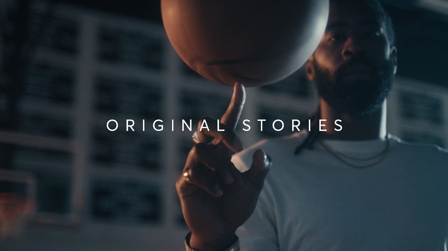
NOTHING BUT ORIGINAL.
In order to show Quibi’s breath of content and land the new line,
we created a new mnemonic using show tiles and imagery.

This updated language and identity was to be used across all collateral.

We created a cinematic edit to land NOTHING BUT ORIGINAL.

And then created a new sizzle highlighting Quibi’s original characters, stories, and format.
Lastly we also created a use case sizzle, to explain Quibi as a service and show off their content.

AD - Erica Barringer
CW - Conner Schrock
CD - Danger Bea